Chances are you’ve had at least one really terrible digital commerce experience, whether as a consumer or a B2B buyer.
Maybe you landed on a site where the homepage provided zero clues to what the brand sells or when trying to narrow products to be aligned with your needs the filters were overly featured-focused, leaving you wondering “do I need a Master’s degree to buy this product?”
As digital-first accelerates and moves toward mobile-first, it is time to be honest with ourselves (and commerce leaders): having a mediocre commerce experience loses customers and allows competitors to see your weaknesses and position themselves as the more customer-centric brand to purchase from. Essentially, it’s self-sabotage.
In Zoovu’s webinar series “Commerce Experiences: The Good, The Bad, & The Ugly” we evaluate e-commerce experiences with an industry expert based on 4 over-arching criteria:
- Site Navigation
- Product Discovery
- Data Quality
- Mobile Friendliness.
Our most recent webinar featured Jason Stokes, CEO of Eastside & Co, a global Shopify Plus Agency, alongside Zoovu’s Chief Strategy Officer, Rodney Rodriquez. We caught up with them following the webinar to ask a few more questions about the commerce experiences they evaluated and what lessons can be acted on.
3 Questions on Evaluating Commerce Experiences and Opportunities for Improvement
1. What are the main criteria in evaluating commerce experiences?
Rodney Rodriquez: There are four criteria we look at when evaluating: Site Navigation, Product Discovery, Data Quality, and Mobile Friendliness. Let me explain why and provide some examples for each of these criteria.
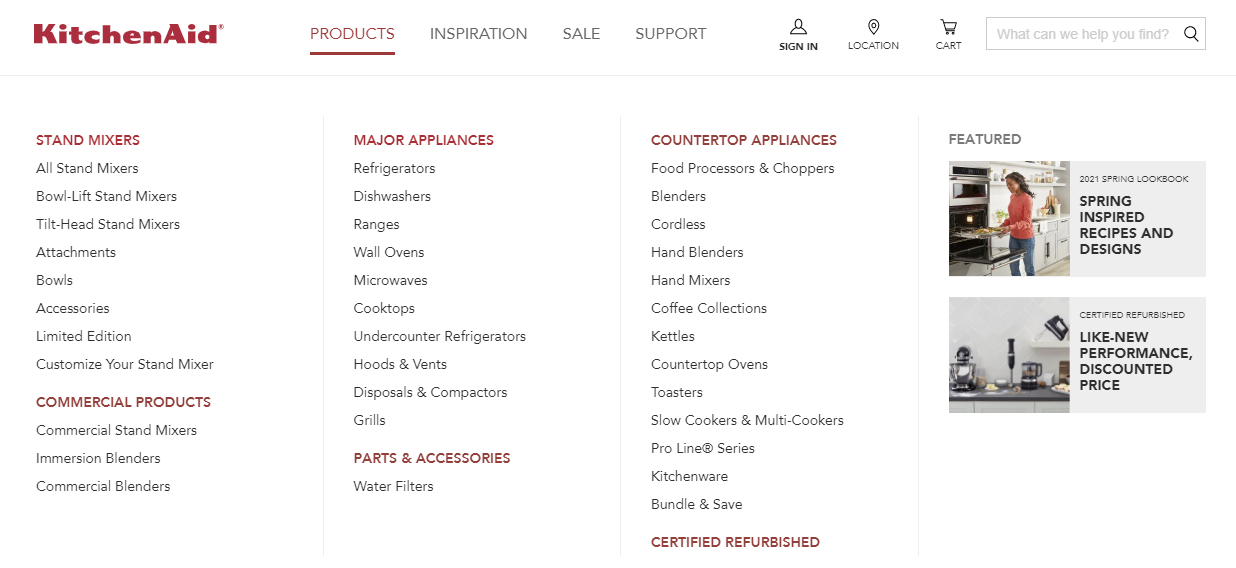
Site Navigation: People will shop in their own unique way, either through habit or other circumstances. Companies need to make it easy to help those shoppers find what they are looking for. Site navigation includes the menu bar which varies in its effectiveness and ease of use. Brands and retailers should consider creating a navigation menu that can support different types of shoppers to:
- For first-time shoppers, top-level category educational content is helpful to increase their knowledge of the category
- For returning customers, have an option to get to a level deeper to the listing page content if users want to get to products fast.
KitchenAid’s site navigation, for example, includes various paths for customers to find what they’re looking for in a clean and educational manner:
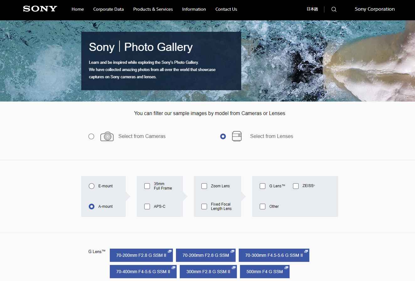
Product Discovery: People want proof that the product works. In order to facilitate an engaging and educational product discovery for shoppers, you need to bring the product to life. This includes media assets like image galleries, promotional videos, social proof, or even provide sample outputs (depending on the category).
One brand that is particularly ingenious with its media assets approach is Sony. They include a photo gallery with sample images taken from various camera models.
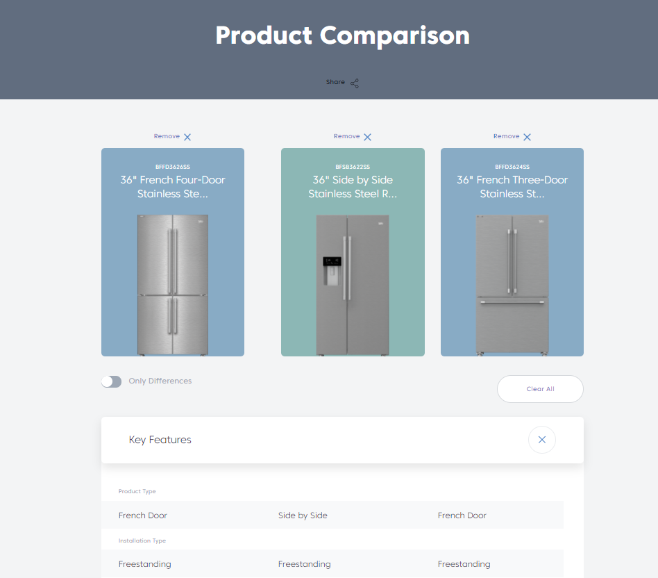
Data Quality: When shoppers narrow down to consider a set of products, they start to compare specifications to find the right product. This helps them understand the value associated with higher prices and if they need the more expensive and elaborate product offering. It is important not to overwhelm them and really focus on the attributes that can help shoppers make a decision.
Beko was missing the key attribute of price. We can see the difference in capabilities across the various models, but don’t know which one provides more value because there is no mention of price.
Mobile Friendliness: Widespread adoption and usage of mobile commerce is rapidly approaching, so mobile experiences must not be neglected. For mobile users, the scrolling and tap experience is the main paradigm. Simply having responsive layouts is not enough, a mobile site needs to be optimized to function with speed and without clutter. It’s important to remember CTAs need to be clear and only about the most important actions they can take in their user journey.
Corning’s mobile experience is outdated and very challenging for a customer to navigate.

2. What is the important thing that companies need to consider in the initial home page experience?
Jason Stokes: Home pages need to very clear on what your company does or sells. For example, if we look at Beko’s home page it’s very unclear what they sell as it’s a generic statement on sustainability. Would you know they sell refrigerators if you landed on it?
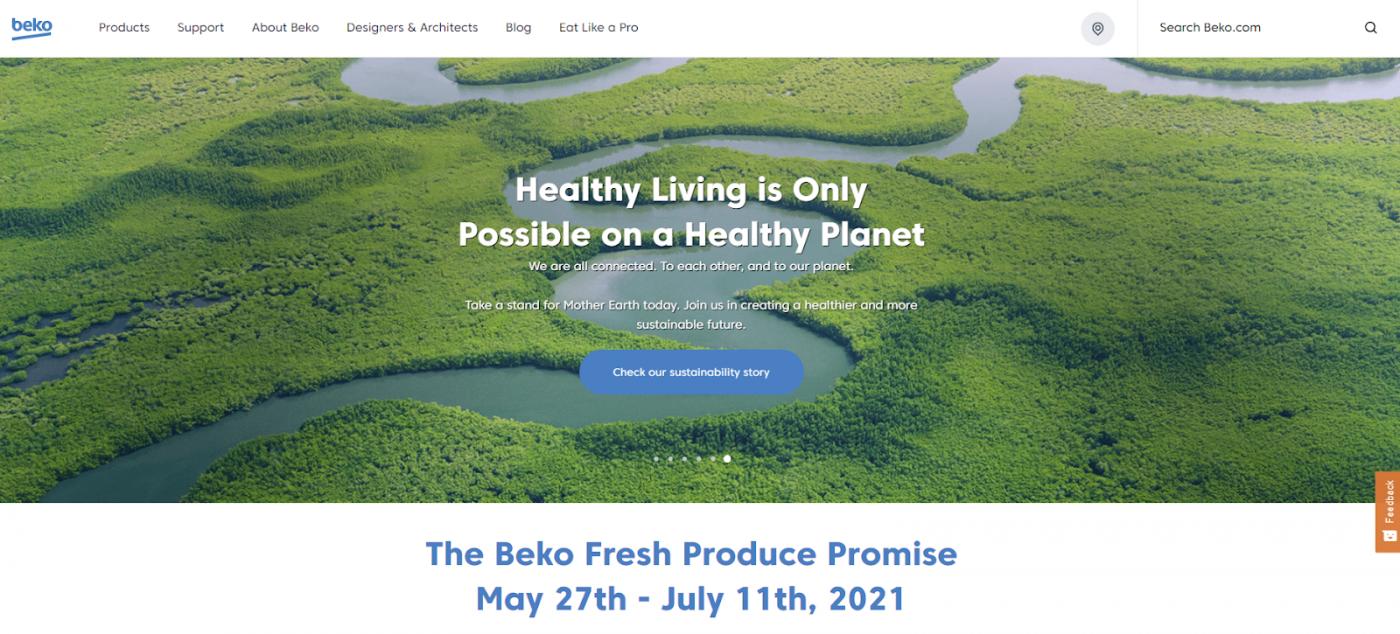
The homepage needs to answer “Why you should buy from us” and convince customers to stay on the site and start their purchase journey over bouncing and going to a competitor. From a design perspective, stay up to date with UX and design best practices, carousels are becoming outdated and don’t function well on mobile.
3. What do companies need to do to help customers make a decision to purchase?
Jason: Educate: It’s imperative to provide content that helps increase the customer’s knowledge of your product category. Many B2B companies do a great job at providing in-depth product content or whitepapers but that research experience can be overwhelming and often is presented in an outdated manner like product spec PDFs.
Regardless of the selling model or who your customers are, present content in a way that captures their attention and keeps them engaged in a delightful way. An example of a dynamic content piece is KitchenAid’s 2021 lookbook that incorporates various media videos and lifestyle imagery with animated components.

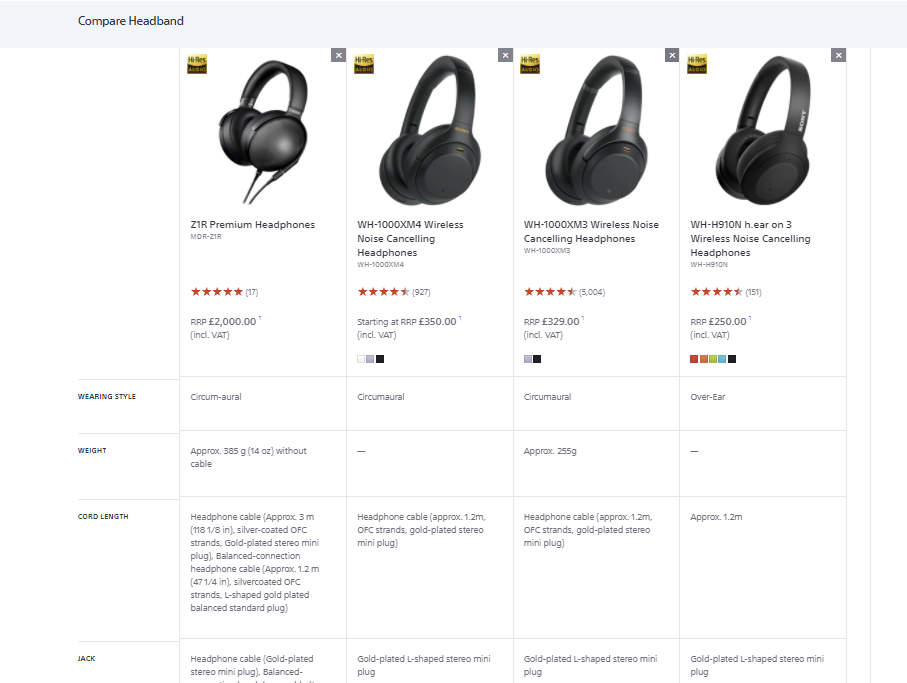
Rodney: Compare: The research part should be aided with comparison tools as well. This helps customers see the differences between products, side-by-side, with meaningful and relevant attributes. For a shopper looking at headphones, does the weight really matter that much or would it better to have battery life listed?
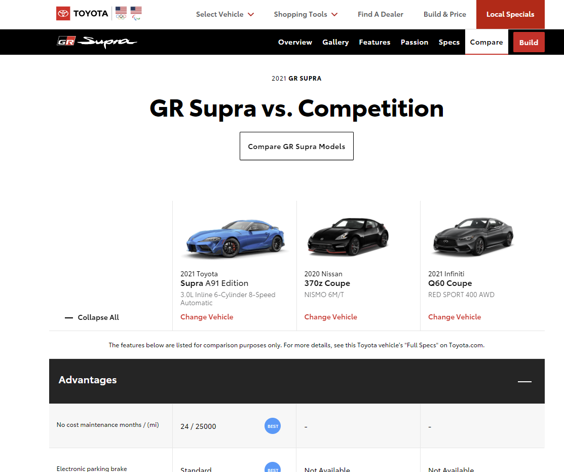
Toyota is a great example of an effective comparison tool. Not only can you compare a model and the various trims, but you can also easily compare among different model line ups (e.g. Prius vs. Camry) and they take it to a next level where you can compare competitive models directly from the Toyota site.
Final Thoughts
Most companies don’t suffer from lack of content, they simply aren’t being effective with how they present and package that content. If the product search and discovery experience are difficult, you’ll lose that sale.
What can companies do?
- Site Navigation: Provide a simple and intuitive for optimal UX and consider adding semantic search to present content in context
- Product Discovery: Integrate tools like digital assistants to remove the laborious research and decision-making process from the customer journey
- Data Quality: Structured data is important to effectively compare products and helping customers understand the differences brings them one step closer to conversion
- Mobile-friendliness: Invest in the mobile experience to be ahead of competitors
Read about the 10 elements of what a best-in-class digital commerce experience looks like.

